
If you searched for YieldMax or single-stock option-income ETFs, you probably want to know what they are and whether those enormous advertised yields are real income. This page answers both: how the structure works, and what mapped 2025 annual filings actually show about earned vs paid across the YieldMax lineup on CoverCall Ledger.
The headline yield is easy to find on any screener. Whether period profit from financial statements supported those payments is the harder question — and it is the only one this site tries to answer.
What these products do
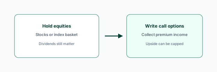
- Hold exposure linked to one stock (or a narrow theme) through options and synthetic structures rather than owning a diversified basket
- Distribute frequently — monthly at launch for most, weekly for a growing share of the lineup
- Accept high unit-price volatility and potential NAV drift as the cost of the distribution design
- Cap upside on the underlying while leaving most of the downside in place
They are not classic diversified covered-call index funds like QYLD or JEPI, and they should not be read with the same expectations.
What the mapped filings show across the lineup
CoverCall Ledger tracks 60 YieldMax funds. Of those, 34 are mapped to a 2025 annual filing; the remaining 26 are tape-only — listed with price and distribution data, but no coverage percentage, because no annual financial statement has been mapped yet. We do not fill those gaps with an estimate.
Across the 34 mapped funds, accrual coverage for the filing year breaks down like this:
| Dist. coverage (2025 filing year) | Mapped YieldMax funds |
|---|---|
| Covered (100%+) | 3 |
| 50–99% | 13 |
| 1–49% | 9 |
| 0% — filings showed a period loss | 9 |
The median mapped YieldMax fund covered roughly 46% of what it distributed. That is the single most useful number on this page: for the typical fund in this family, accrual earnings supported well under half the cheque for that filing year.
Two caveats before reading anything into it. First, 25 of the 34 are mapped to the fiscal year ended October 31, 2025; the other nine cover partial-year "stub" periods from a recent launch, which are noisier and not comparable to a full year. Second, coverage is a backward-looking accounting fact for one stated period, not a forecast and not a verdict on the strategy.
The three that covered
| Ticker | Fund | Dist. coverage | Earned vs paid | Period |
|---|---|---|---|---|
| GOOY | YieldMax GOOGL Option Income Strategy | Covered | $59.5M vs $56.5M | FY Oct 2025 |
| HOOY | YieldMax HOOD Option Income Strategy | Covered | $85.7M vs $85.0M | 2025 stub |
| CHPY | YieldMax Semiconductor Portfolio Option Income | Covered | $2.0M vs $1.6M | 2025 stub |
Note how thin those margins are — and that two of the three are partial-year windows. Full coverage in this family was the exception, not the pattern.
Widely held names, mapped
| Ticker | Dist. coverage | Earned vs paid (FY Oct 2025) |
|---|---|---|
| AMDY | 77% | $91.9M vs $119.1M |
| TSLY | 56% | $512.9M vs $921.4M |
| NVDY | 51% | $564.7M vs $1,108.8M |
| YMAX | 34% | $157.5M vs $467.9M |
| CONY | 25% | $291.5M vs $1,178.0M |
| ULTY | 14% | $138.0M vs $988.6M |
| MSTY | 0% | Loss of $730.3M vs $3,198.8M paid |
MSTY is the clearest illustration of the gap between a distribution rate and earned income: the fund distributed roughly $3.2 billion while its filings reported a period loss. Accrual coverage reads 0% because there was no period profit to divide — not because the fund paid nothing.
Why a fund can read 0%
A 0% reading means the mapped statements showed a loss for the period, so nothing was earned on the accrual lens to set against distributions. For a single-stock option-income fund, that usually means the underlying fell far enough that mark-to-market losses swamped the option premium and dividend income collected. The cash still went out the door; it came from somewhere other than period profit.
This is a coverage statement, not a tax statement. Whether any part of a payment is characterized as return of capital is a separate question decided by tax rules and reported by the issuer — see Return of capital vs "earned the cheque".
2026 context
Reports through 2026 describe shrinking weekly distributions and continued NAV decline across several YieldMax funds, and YieldMax's own prospectus language notes that a portion — sometimes significant — of a fund's distributions may be classified as return of capital. Issuer Section 19(a) notices are the primary source for how each payment was characterized.
That commentary is context for why the question matters. It does not change any figure above: every coverage percentage on this site comes from a mapped annual filing, never from news, yield, or the last distribution.
Canada's related shelf
Harvest High Income Shares funds use concentrated single-name sleeves on Canadian listings — a similar idea with different filings. HHIS mapped 2025 coverage at 88%, while MSTE read 0% against $120.7M distributed. For the broader Canadian picture, see High yield covered call ETF Canada.
How to read these on CoverCall Ledger
1. Open the fund page and check whether Dist. coverage is mapped or tape-only before anything else.
2. Read earned vs paid rather than the coverage percentage alone — the dollar gap is the story.
3. Check the period label. A stub year is not a full year.
4. Keep 2026 YTD and last distribution in the tape column, separate from the filing year.
5. Confirm against the issuer's annual financial statements and 19(a) notices.
Sort the live coverage table by Dist. coverage, or browse the full fund directory. Walkthrough of the labels: How to read Dist. coverage. Yield confusion: Distribution coverage vs yield. Index option income: JEPI vs JEPQ vs QYLD.
Educational research from public issuer filings — not investment advice, and not a recommendation to buy or sell any fund.